You could have perfect anatomy, clean lines, and compelling concepts—but without good color choices, your artwork might still fall flat. Color theory is the secret weapon that helps your illustrations grab attention, tell stories, and stir emotion.
At Aureole Studios, we help students go beyond just “picking pretty colors” and instead apply intentional color theory to every painting and design. Here’s how mastering color can bring your portfolio to life.
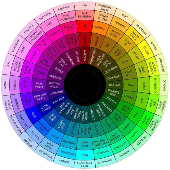
1. Understand Color Relationships
Before diving into complex palettes, it’s important to understand the basics: complementary, analogous, and triadic color schemes.
- Complementary: colors opposite on the color wheel (like blue/orange) create strong contrast
- Analogous: colors beside each other (like red/orange/yellow) feel harmonious
- Triadic: colors evenly spaced around the wheel (like red/blue/yellow) offer vibrant balance
Try creating one piece using each type of scheme—it’s a great way to expand your creative range.
2. Learn Warm vs Cool Temperatures
Color temperature changes everything. Warm colors (red, orange, yellow) feel energetic and alive, while cool colors (blue, green, purple) calm things down.
Even within a single character or background, mixing warm and cool helps you show depth, volume, and atmosphere.
Pro tip: Use warm colors for focal points and cool tones in the background to create visual hierarchy.
3. Use Color for Mood and Storytelling
Colors aren’t just aesthetic—they tell stories. A gray-blue scene feels lonely or quiet. A red-lit environment might feel dramatic or dangerous.
When building your portfolio, use color to create emotional tone and narrative—especially in sequential illustrations or character concepts.
Ask yourself: What emotion do I want this piece to express? Then build your palette accordingly.
4. Don’t Overcomplicate Your Palette
One of the most common beginner mistakes is using too many colors. Instead, choose 2–4 dominant hues, and build variations through saturation, brightness, and value.
At Aureole, we teach students to build limited but versatile palettes that keep their work cohesive and professional.
Exercise: Limit yourself to just 3 hues and build an entire environment piece.
5. Make Your Colors Work Harder
Here’s a secret: you can control focus, motion, and shape—all through color.
- Use high contrast to draw the eye.
- Use saturation shifts to show importance.
- Use temperature variation to separate planes of space.
Great artists don’t just paint—they direct the viewer’s experience with every color choice.
Want to Boost Your Color Confidence?
Our 电脑数码绘画 and Super Paint Slay classes at Aureole Studios give students the practical tools to master color theory, build mood boards, and execute color scripts for portfolio pieces.
👉 Explore Digital Painting Courses
👉 Join Our Portfolio Prep Program